Motivation
Around a year ago, a subscriber on my YouTube channel requested that I create a video on “Quantile regression”. Although I had no prior experience with this regression technique, I accepted the assignment and began researching the topic. After gaining a basic understanding of the technique, I created a video which was well-received by my audience, and has since become one of my most viewed videos. You can watch the video below. Several viewers have also requested that I make the code available, and I apologize for the delay in doing so due to time constraints. Better than never, I will share you the code today. Thanks for your patience.
What is qauntile regression?
Quantile regression is a statistical technique used to model the relationship between a response variable and one or more predictor variables. Unlike traditional regression models that estimate the mean of the response variable given the predictor variables, quantile regression estimates the conditional quantiles of the response variable.
An equal probability portion of a distribution is represented by a quantile. When the median is the 50th percentile, for instance, 50% of the distribution’s values fall below the median and 50% fall above it. We can estimate any conditional quantile of the response variable in quantile regression, not only the median.
Quantile regression’s primary benefit is that it enables us to model the relationship between the predictor variables across different parts of the distribution of the response variable. This can be useful when the relationship between the predictor variables and the response variable is not constant across the distribution, for example, when the relationship is stronger in the tails of the distribution.
Quantile regression can be a good choice if the data violate some of the key assumptions in ordinary least square regression (OLS): domesticity and normality. It is also robust to outliers or influential data points.
Without spending more time, I will proceed directly to the codes. I need few libraries and I will use the life_expectancy data set. I will use quantreg package to do the models(life expactancy as a function of income) and plotly to visualize the coefficients in 3D.
Read Datasets
      Country Year     Status Life.expectancy Adult.Mortality
1 Afghanistan 2015 Developing            65.0             263
2 Afghanistan 2014 Developing            59.9             271
3 Afghanistan 2013 Developing            59.9             268
4 Afghanistan 2012 Developing            59.5             272
5 Afghanistan 2011 Developing            59.2             275
6 Afghanistan 2010 Developing            58.8             279
  infant.deaths Alcohol percentage.expenditure Hepatitis.B Measles
1            62    0.01              71.279624          65    1154
2            64    0.01              73.523582          62     492
3            66    0.01              73.219243          64     430
4            69    0.01              78.184215          67    2787
5            71    0.01               7.097109          68    3013
6            74    0.01              79.679367          66    1989
   BMI under.five.deaths Polio Total.expenditure Diphtheria HIV.AIDS
1 19.1                83     6              8.16         65      0.1
2 18.6                86    58              8.18         62      0.1
3 18.1                89    62              8.13         64      0.1
4 17.6                93    67              8.52         67      0.1
5 17.2                97    68              7.87         68      0.1
6 16.7               102    66              9.20         66      0.1
        GDP Population thinness..1.19.years thinness.5.9.years
1 584.25921   33736494                 17.2               17.3
2 612.69651     327582                 17.5               17.5
3 631.74498   31731688                 17.7               17.7
4 669.95900    3696958                 17.9               18.0
5  63.53723    2978599                 18.2               18.2
6 553.32894    2883167                 18.4               18.4
  Income.composition.of.resources Schooling
1                           0.479      10.1
2                           0.476      10.0
3                           0.470       9.9
4                           0.463       9.8
5                           0.454       9.5
6                           0.448       9.2
I will now do some data cleaning. The variable names are a bit tedious and to avoid using the back ticks. I will simply clean up the column names using the janitor packages very useful clean_names() function
life_expe_data  <- clean_names(life_exp)
names(life_expe_data)
[1] "country"
[2] "year"
[3] "status"
[4] "life_expectancy"
[5] "adult_mortality"
[6] "infant_deaths"
[7] "alcohol"
[8] "percentage_expenditure"
[9] "hepatitis_b"
[10] "measles"
[11] "bmi"
[12] "under_five_deaths"
[13] "polio"
[14] "total_expenditure"
[15] "diphtheria"
[16] "hiv_aids"
[17] "gdp"
[18] "population"
[19] "thinness_1_19_years"
[20] "thinness_5_9_years"
[21] "income_composition_of_resources"
[22] "schooling" Now the variable names are clean, we can do the rest of the coding as follows.I now remove the missing values. You can do better for your data by using imputation techniques to deal with missing values. But that is not my goal here today. Perhaps, I may do a blog or a YouTube video in the future. I just need you to demand for it or encourage me to do it.
life_exp_narm  <- life_expe_data[complete.cases(life_expe_data),]
dim(life_exp_narm)
[1] 1649 22life_exp_narm <- life_exp_narm |>
filter(income_composition_of_resources>0) #let's remove all with income index around 0. We have about 22 variables and 1649 observations. Not bad for modelling! Since, income_composition_of_resources is a really long and boring variable name, I am changing it.
summary(life_exp_narm$income_index) Min. 1st Qu. Median Mean 3rd Qu. Max.
0.2790 0.5290 0.6770 0.6505 0.7540 0.9360 sd(life_exp_narm$income_index)[1] 0.1490056summary(life_exp_narm$life_expectancy) Min. 1st Qu. Median Mean 3rd Qu. Max.
44.00 64.60 71.80 69.39 75.00 89.00 sd(life_exp_narm$life_expectancy)[1] 8.876531You can see that our main predictor variable has a mean 0.65 and SD of 0.149. It maybe a good idea to take a look at it by visualizing it. And the mean life expectancy was 69.4(SD=8.88)
ggplot(life_exp_narm, aes(x=income_index,
                          y=life_expectancy, col=status)) + geom_point() +
geom_smooth(method = "lm", col="blue") +
  xlab("Income index") + ylab("Life expectancy")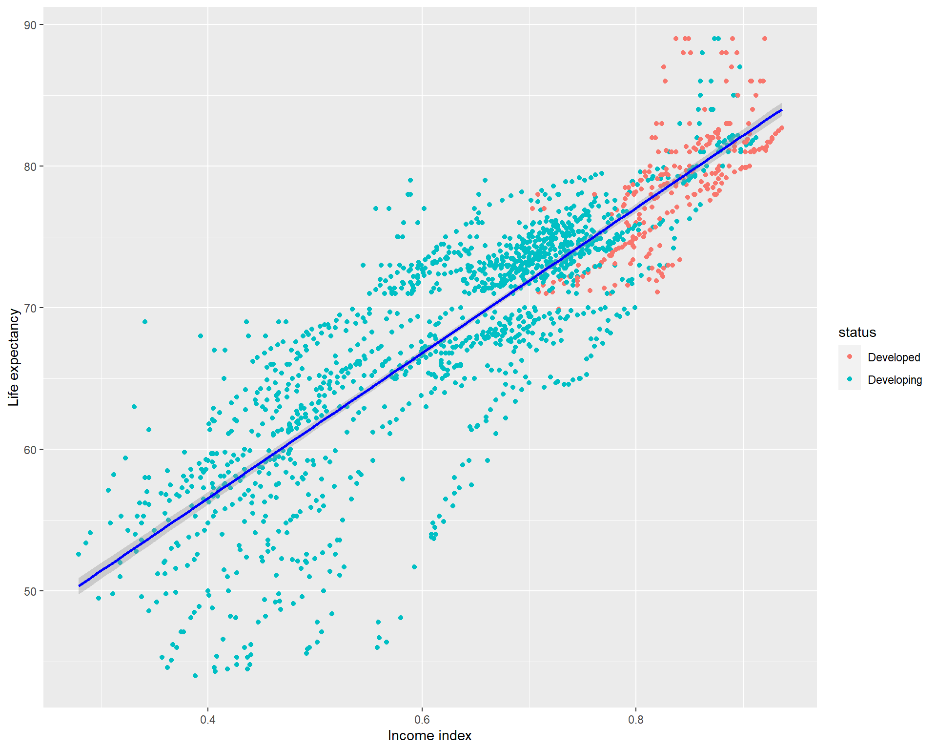
Qauntile regression
Before doing the quantile regression. It might be a good idea to take a look at the visualization by setting different tau values in abline of the base r plot showing the relationship between life_expectancy and income_index. The
OLS regression is do the regression from the mean while the quantil regression n quantile regression, we can estimate any conditional quantile of the response variable, not just the mean but could be the medeian (50%), 90%, 75% or anywhere until 99%.If this is not clear, I highly recommended watching the video I dropped earlier.
Let’s now visualize the mean and the median ablines
plot(life_expectancy  ~ income_index, data = life_exp_narm)
abline(lm(life_expectancy  ~ income_index, data = life_exp_narm), col="blue", lwd = 3)
abline(rq(life_expectancy ~ income_index, tau=0.5, data = life_exp_narm), col="red", lwd = 4) # Notcie the tau=0.5, 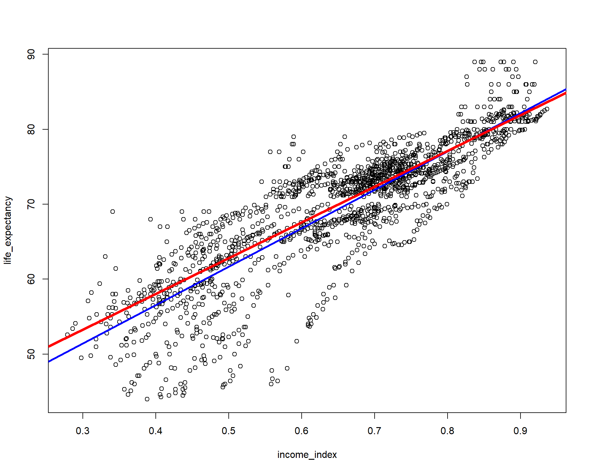
You can see the plot blue line is the OLS regression line but the red line is if we model the regression using the median. If you have to run only two models and choose the model that best fits the data, you have to choose by AIC or using loss function(eg. the model with minimum mean squared error or mean absolute error, etc will be the best fit). NB: choosing the right model is not my goal here.
Now let’s add 10th and 90th percentiles from the above vizualization and evaluate which line looks better fit for the relationship between the two variables.
plot(life_expectancy  ~ income_index, data = life_exp_narm)
abline(lm(life_expectancy  ~ income_index, data = life_exp_narm), col="blue", lwd = 3)
abline(rq(life_expectancy  ~ income_index, tau=0.5, data = life_exp_narm), col="red",  lwd = 4)
abline(rq(life_expectancy  ~ income_index, tau=0.1, data = life_exp_narm), col="black",  lwd = 5)
abline(rq(life_expectancy  ~ income_index, tau=0.90, data = life_exp_narm), col="turquoise4",  lwd = 6)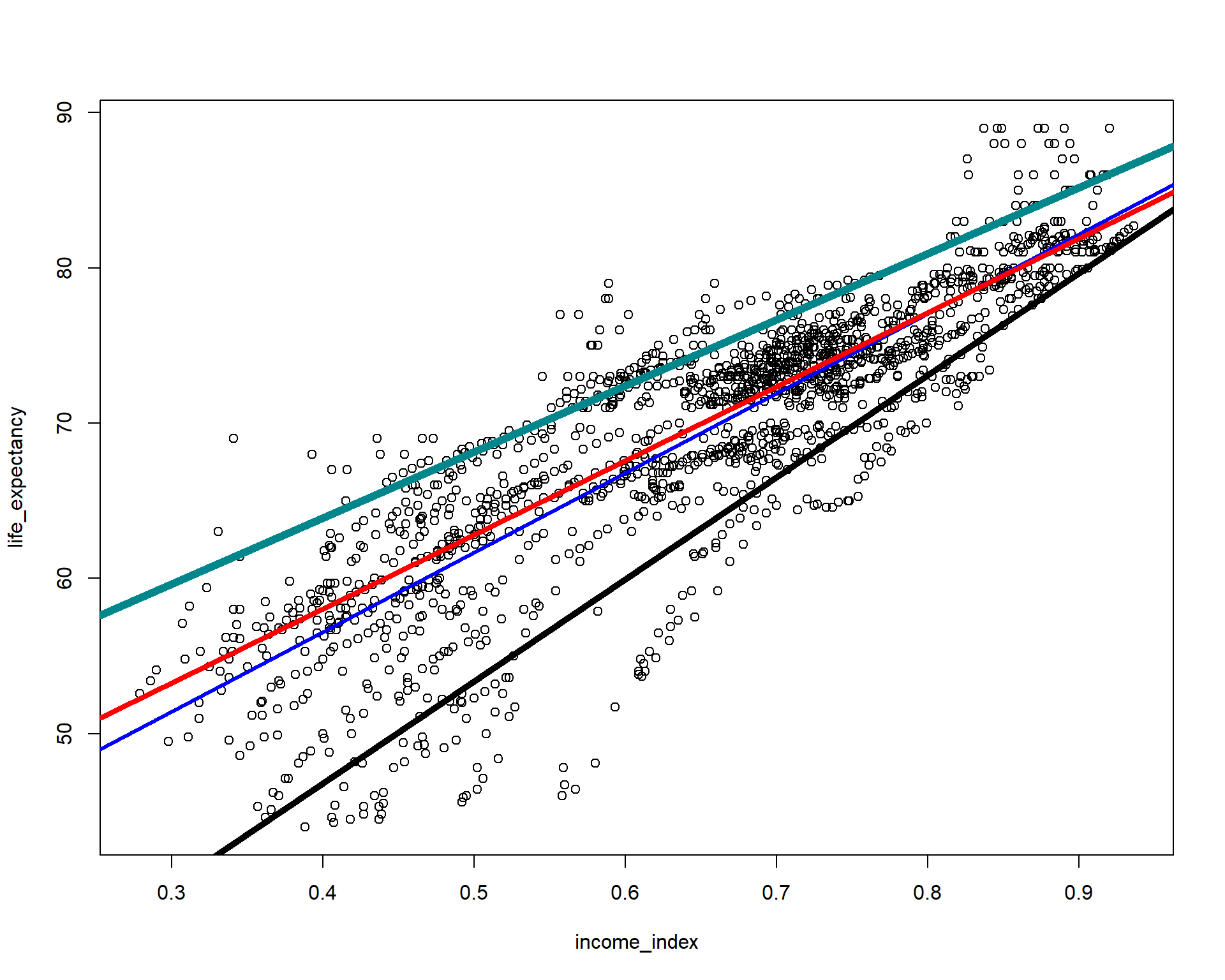
We can actually visualize multiple quantreg models and see it compared to the OLS model.
ggplot(life_exp_narm, aes(income_index, life_expectancy))+
    geom_point()+
    geom_smooth(method = lm, se = F, color = "darkturquoise")+ #linear model
    geom_quantile(color = "red", quantiles = 0.5)+
    geom_quantile(color = "black", alpha = 0.2, #Quantreg based on median
                  quantiles = seq(.05, .95, by = 0.05)) #multiple models from the 5th percentile to 95th percentile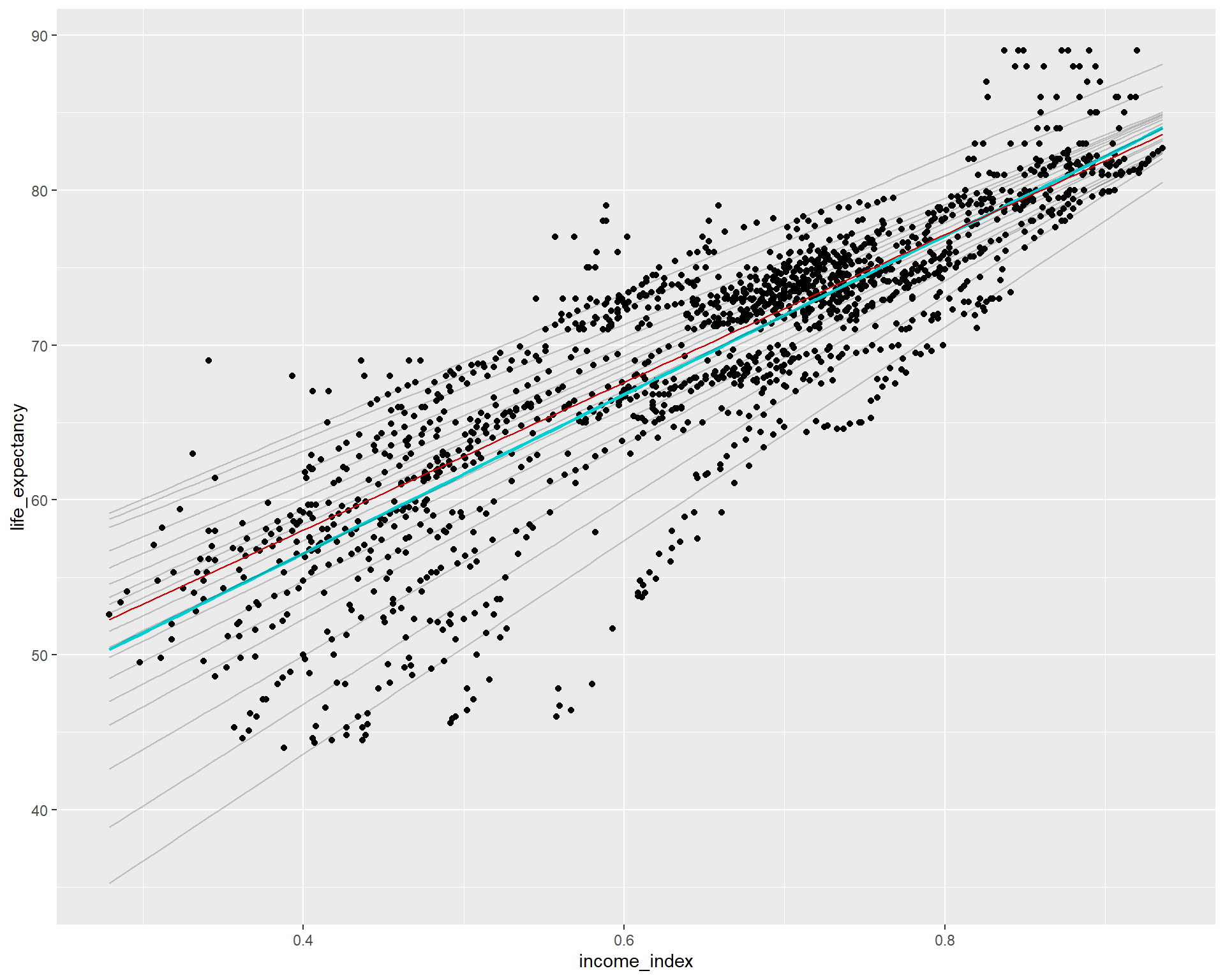
Let’s now run four different models at the mean(OLS), and quantile regressions at the median, 10th percentile and 95th percentiles. Notice the tau values. I also added one more variable.
ols <-  rq(life_expectancy~income_index+schooling, data = life_exp_narm) #Similar to lm()
quant_reg_med  <- rq(life_expectancy~income_index+schooling,tau = 0.5, data = life_exp_narm)
quant_reg_first  <- rq(life_expectancy~income_index+schooling,tau = 0.1, data = life_exp_narm)
quant_reg_last <- rq(life_expectancy~income_index+schooling,tau = 0.95, data = life_exp_narm)summary(ols)
Call: rq(formula = life_expectancy ~ income_index + schooling, data = life_exp_narm)

tau: [1] 0.5

Coefficients:
             Value    Std. Error t value  Pr(>|t|)
(Intercept)  38.59204  0.56239   68.62125  0.00000
income_index 62.04691  1.98135   31.31544  0.00000
schooling -0.75195 0.10388 -7.23903 0.00000summary(quant_reg_med)
Call: rq(formula = life_expectancy ~ income_index + schooling, tau = 0.5,
    data = life_exp_narm)

tau: [1] 0.5

Coefficients:
             Value    Std. Error t value  Pr(>|t|)
(Intercept)  38.59204  0.56239   68.62125  0.00000
income_index 62.04691  1.98135   31.31544  0.00000
schooling -0.75195 0.10388 -7.23903 0.00000summary(quant_reg_first)
Call: rq(formula = life_expectancy ~ income_index + schooling, tau = 0.1,
    data = life_exp_narm)

tau: [1] 0.1

Coefficients:
             Value    Std. Error t value  Pr(>|t|)
(Intercept)  25.92063  1.81747   14.26195  0.00000
income_index 84.00142  5.34145   15.72633  0.00000
schooling -1.34938 0.22578 -5.97661 0.00000summary(quant_reg_last)
Call: rq(formula = life_expectancy ~ income_index + schooling, tau = 0.95,
    data = life_exp_narm)

tau: [1] 0.95

Coefficients:
             Value     Std. Error t value   Pr(>|t|)
(Intercept)   46.56308   0.40214  115.78932   0.00000
income_index  57.37912   2.25777   25.41402   0.00000
schooling     -0.69824   0.10643   -6.56032   0.00000
Let’s have a closer look of the median model relative to the lm.
# Plot data points and regression models
ggplot(life_exp_narm, aes(income_index, life_expectancy)) +
  geom_point() +
  geom_smooth(method = lm, se = FALSE, color = "red", size = 0.5) + # linear model
  geom_quantile(color = "darkturquoise", quantiles = 0.5, size=2) + # median quantile regression model with tau = 0.5
    geom_quantile(color = "black", quantiles = 0.1, size=0.5) + #quantreg based on the 10th percentile
      geom_quantile(color = "yellow", quantiles = 0.75, size= 0.5) + #quantreg based on the 10th percentile
  geom_segment(aes(x = income_index, y = life_expectancy, xend = income_index, yend = predict(quant_reg_med, newdata = life_exp_narm)),
               color = "darkgray", size = 0.1) + # distance line based on median quantile regression model
  labs(title = " Life Expectancy~Income Index", y = "Life Expectancy", x = "Income Index")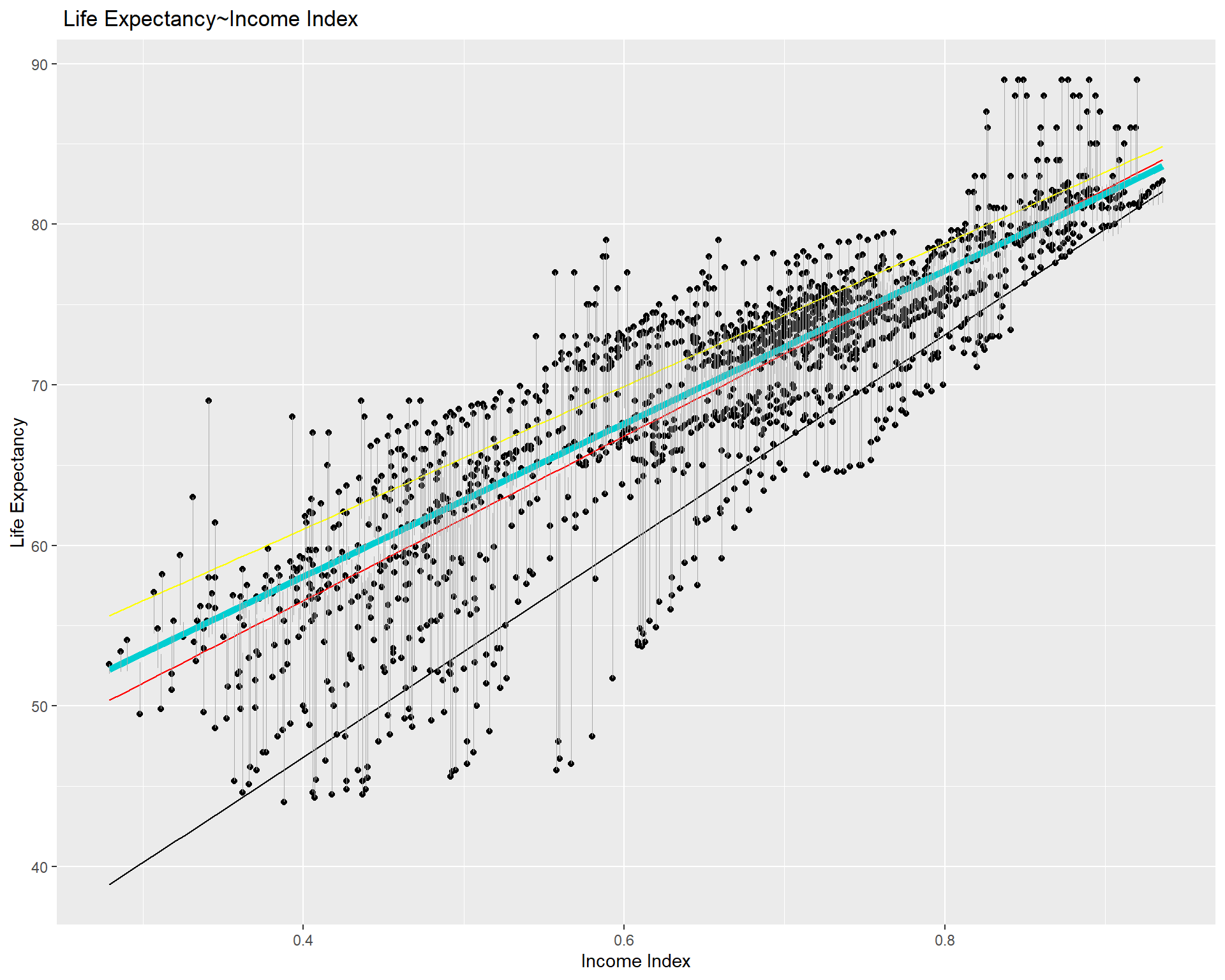
We can plot the coefficients of the four different models we modeled earlier and compare them.
plot_models(ols, quant_reg_med, quant_reg_first, quant_reg_last,
           show.values = TRUE,
           m.labels = c("OLS", "Median", "10th percentile",
                       "95th percentile",
                       legend.title = "Model")
           )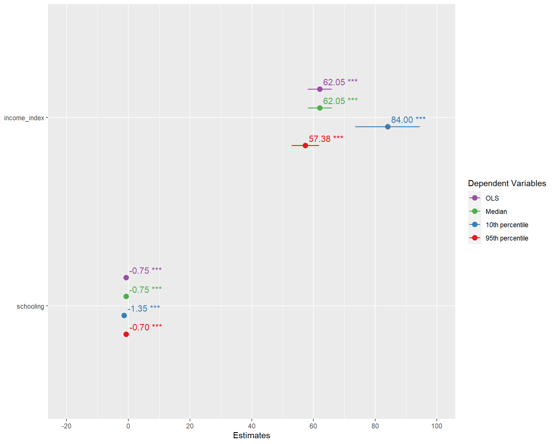
You can see the OLS(based one mean) and quanitile regression based on the median are identical.But the one with 10th percentile and 95th percentile are different from the coefficients of the OLS.
For effectively modeling numerous quantreg models, you may do somthing like the following.
taus<-seq(from = .05, to = .95, by = 0.05) #Taus ranging from 0.05 to 0.95 with a step value of 0.05
quant_all  <- rq(life_expectancy~income_index,tau = taus,
data = life_exp_narm)names(quant_all) #To access the cntents of our model [1] "coefficients" "x" "y" "residuals"
[5] "dual" "fitted.values" "formula" "terms"
[9] "xlevels" "call" "tau" "rho"
[13] "method" "model" quant_all$tau #To see the taus [1] 0.05 0.10 0.15 0.20 0.25 0.30 0.35 0.40 0.45 0.50 0.55 0.60 0.65
[14] 0.70 0.75 0.80 0.85 0.90 0.95With that we have got several models. But how we access a specific model for example when tau=0.8 or tau=0.1?
[[1]]

Call: rq(formula = life_expectancy ~ income_index, tau = taus, data = life_exp_narm)

tau: [1] 0.8

Coefficients:
             Value    Std. Error t value  Pr(>|t|)
(Intercept)  44.77157  0.62620   71.49715  0.00000
income_index 42.89216 0.79348 54.05567 0.00000[[1]]
Call: rq(formula = life_expectancy ~ income_index, tau = taus, data = life_exp_narm)
tau: [1] 0.1
Coefficients:
Value Std. Error t value Pr(>|t|)
(Intercept) 20.52315 1.70906 12.00844 0.00000
income_index 65.74074 2.18924 30.02897 0.00000If we want to compare the AIC values of these models, as usual we can use AIC()
aic_df <- data.frame(AIC = AIC(quant_all), model = paste("tau =",taus))
head(aic_df)
AIC model
1 10945.777 tau = 0.05
2 10550.411 tau = 0.1
3 10230.887 tau = 0.15
4 9978.270 tau = 0.2
5 9771.004 tau = 0.25
6 9618.262 tau = 0.3ggplot(aic_df, aes(x = model, y = AIC)) +
geom_bar(stat = "identity", fill = "steelblue") +
labs(title = "AIC values for different tau values",
x = "Quantile regression models with different Tau values",
y = "Akaike Information Criterion") +
theme(axis.text.x = element_text(angle = 90, hjust = 1))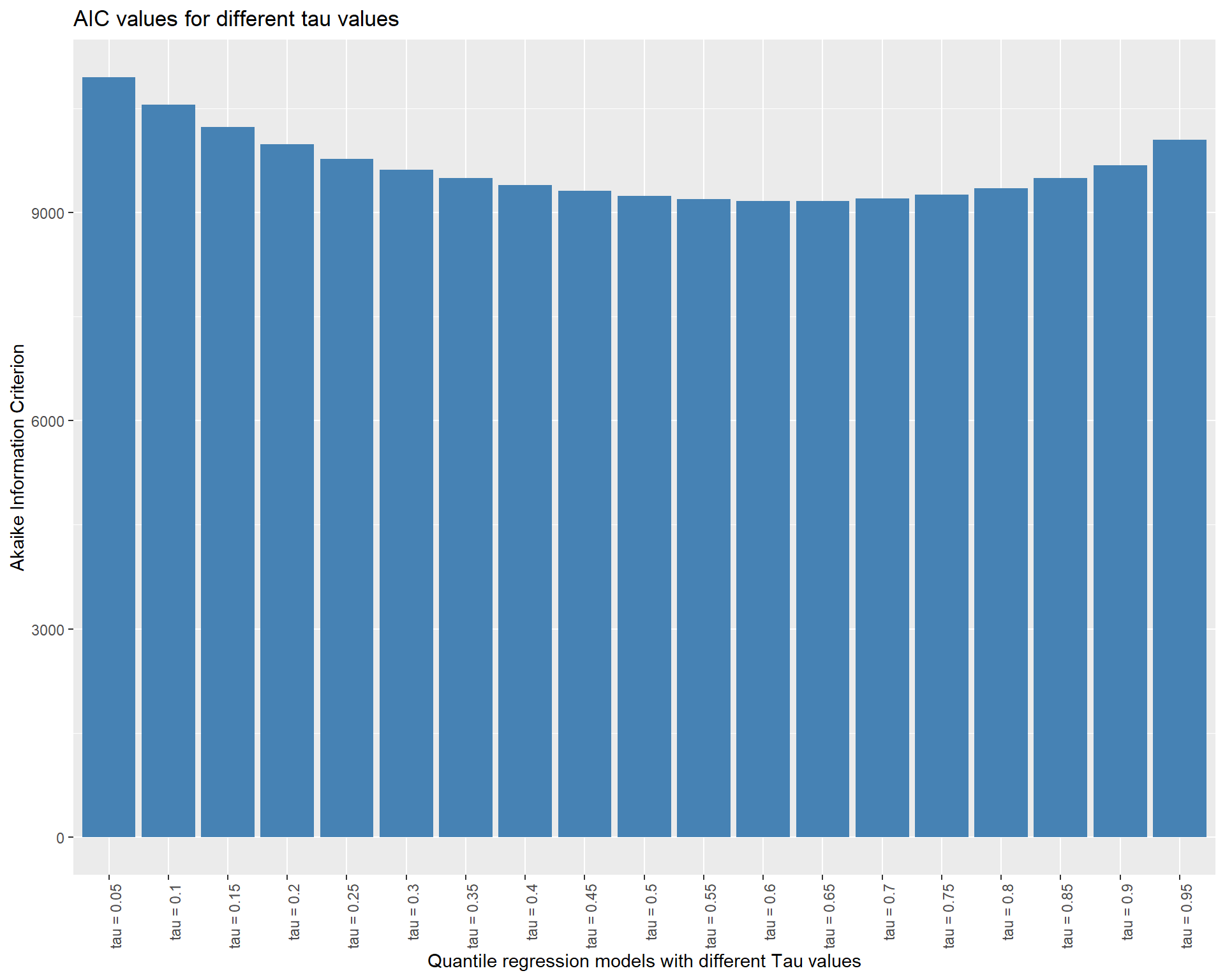
It seems the model around the median point is better fit. In general, we ought to pick the model with the lowest AIC score. AIC (Akaike Information Criterion) is a metric used to assess a statistical model’s suitability for a particular set of data. It is based on the model’s complexity as well as its goodness of fit. The model is thought to be better the lower the AIC value.
However, it’s crucial to remember that the AIC should not be the only factor considered when choosing a model. When choosing a model, it is important to take into account a number of additional elements, including interpretability, applicability, and theoretical relevance. It’s also possible that none of the models have an AIC that is noticeably superior to the others, in which case other factors might be more crucial in selecting a model.
How about if we want to access the coefficients?
QR.coef <- coef(quant_all)Or in a more complicated way like the following
lprq <-  function(x, y, h, m=19 , tau=.5)
  {
    xx <- seq(min(x),max(x),length=m)
    fv <- xx
    dv <- xx
    for(i in 1:length(xx)) {
      z <- x - xx[i]
      wx <- dnorm(z/h)
      r <- rq(y~z, weights=wx, tau=tau, ci=FALSE)
      fv[i] <- r$coef[1.]
      dv[i] <- r$coef[2.]
    }
    data.frame(dv = dv)
}

#Create a matrix to save the QQR estimates
taus<-seq(from = .05, to = .95, by = 0.05)

QQR.coef <- as.data.frame(matrix(0, ncol = 19, nrow = 19))

# Run QQR in a loop and save estimates in matrix "QQR.coef"
#Note: 0.05 in below loop is the bandwidth that can be adjusted

o <-life_exp_narm$life_expectancy
p <-life_exp_narm$income_index

for (i in 1:19){
  x<-lprq(o, p,0.05,tau=taus[i])
  QQR.coef[,i]<-x
}
Let’s now save all coefficients in a matrix
beta <- as.matrix(QQR.coef)Vizualize
p <- plot_ly( z = ~beta, x = ~taus, y = ~taus, opacity = 0.6) %>%
  add_markers()

p %>% add_surface(z = ~beta, x = ~taus, y = ~taus, showscale = FALSE) %>%
  layout(showlegend = FALSE)
Quantile process plot
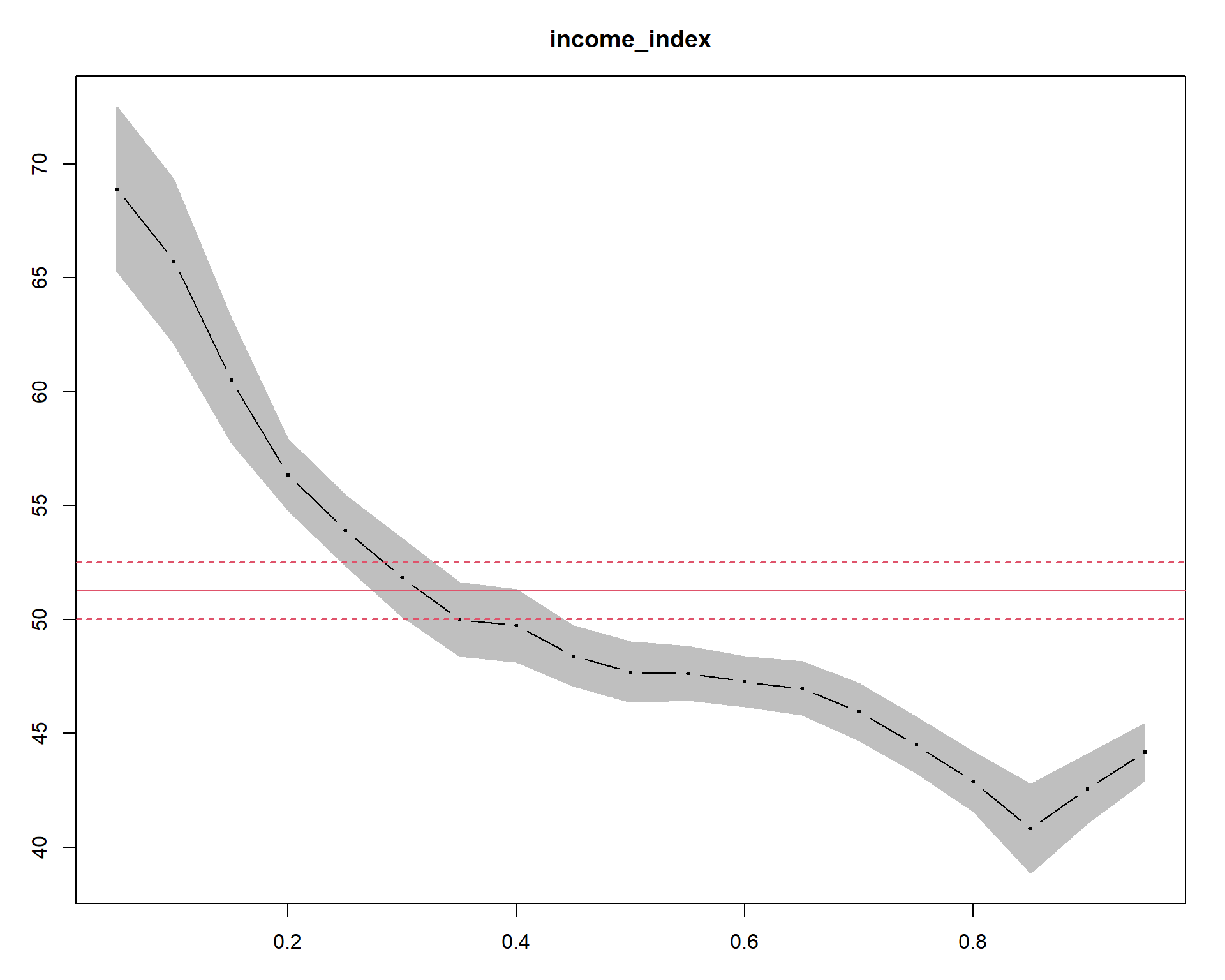
The summary(quant_all) |> plot(“income_index”) command generates a Quantile Process Plot for the variable income_index. Quantile process plot is a graphical tool to assess the relationship between the response variable (in our case, life_expectancy) and the predictor variable (income_index) across different quantiles of the response distribution. The x-axis represents the predictor variable, and the y-axis represents the quantiles of the response variable. The plot shows a line for each quantile of interest (0.05, 0.1, 0.15, …, 0.95), indicating the estimated relationship between income_index and the corresponding quantile of life_expectancy. The shaded area is for quantile regression and its confidence intervals.The slope of each line represents the estimated effect of income_index on the given quantile of life_expectancy.The solid and dashed red lines show the linear model and its lower and upper bound confidence intervals, respectively. In the plot, we can see only a very small region(from around 0.25 to 0.4) overlaps with the linear model. The large portion of the plot when income index is larger than 0.4 or when it is lower than 0.2 is not overlapping indicating difference between the quantreg approach and the OLS modeling approach.
In addition, we can see curvatures or non-linearity in the lines, which may indicate that the relationship between the variables is more complex than a simple linear one.Hence, a more complex model maybe necessary to capture the full range of the relationship between the two variables.
That is all for today. Again I highly recommend watching the video and reading quantreg package functions. I hope, you like it.See you in the next post.
Contact
Please mention @RPy_DataScience if you tweet this post.
If you have enjoyed reading this blog post, consider subscribing for upcoming posts.