Inverse Probability Weighting and Marginal Structural Models: comprehensive tutorial
In this post, I will go through a basic introduction to the Inverse Probability Weighting and Marginal Structural Models for estimating the causal effects of a treatment on an outcome.
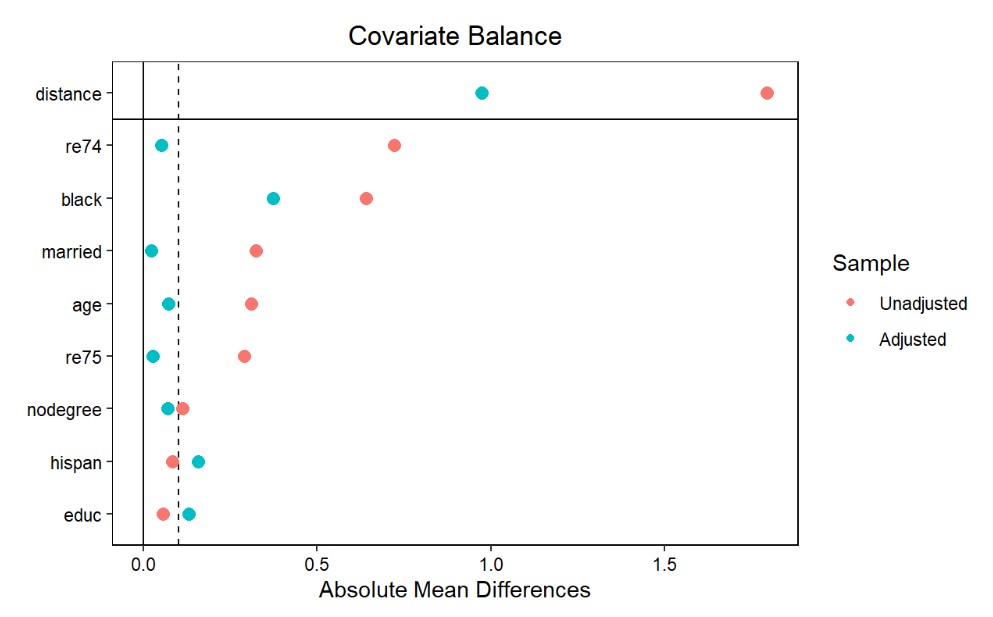
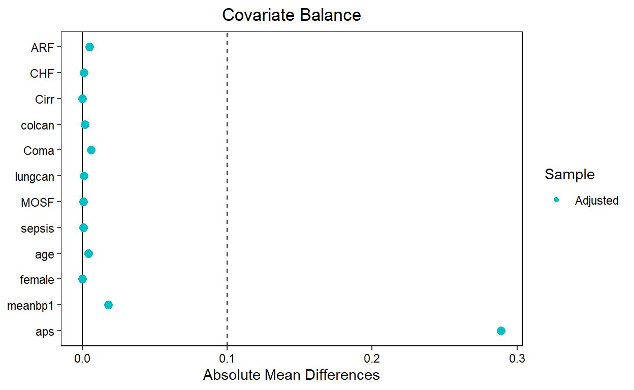
RWE Data Analysis Using Propensity Score Matching (PSM): Concept, Implementation, and Interpretation
In this post, I will go through a basic introduction to the Propensity Score Matching (PSM) method for estimating the causal effects of a treatment on an outcome. PSM is one of the most commonly implemented methods in observational RWE studies.
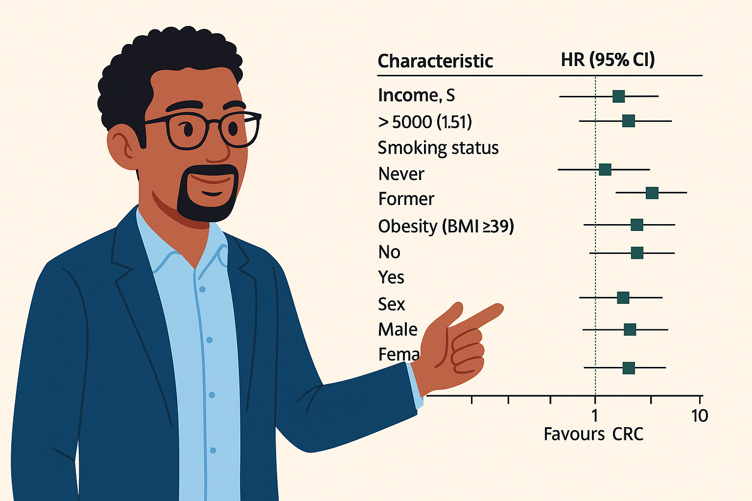
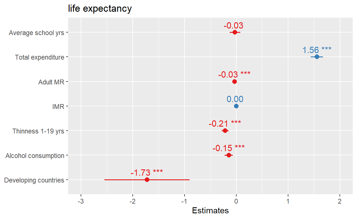
Still presenting regression results in tables? why not forest plots?
In this post I reproduce an elegant JAMA forest plot using R and Python.
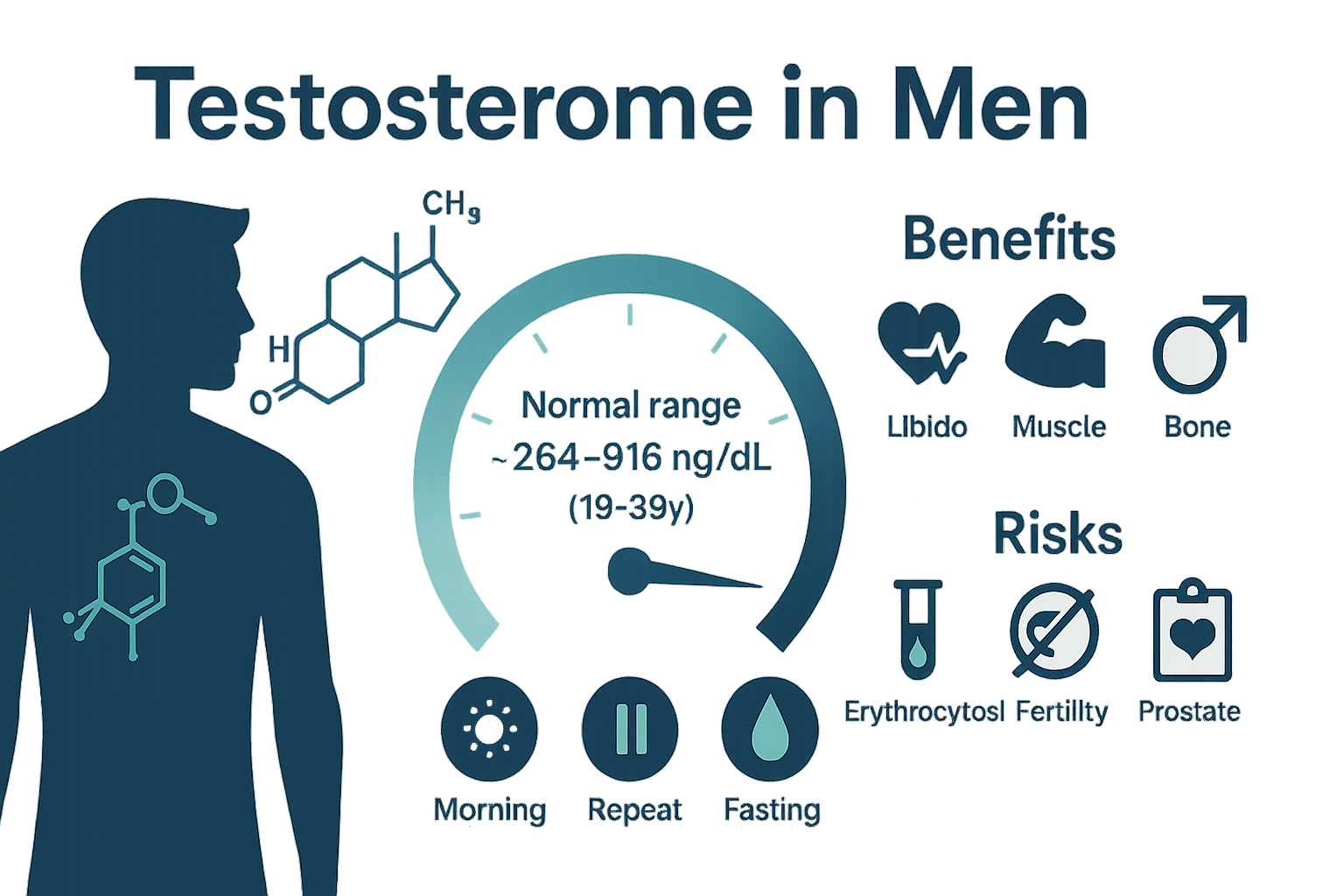
Vizualizing global testosterone levels by country
Scrapping global testosterone data from the world population review website and vizualizing it
Quantile regression tutorial in R
This is a quick demonstration of quantile regression in R

XGboost, Naive Bayes and SVM Machine learning algorithms for facilitating title-abstract screening in systematic reviews: predicting inclusion/exclusion of abstracts
Machine learning methods for document classification.
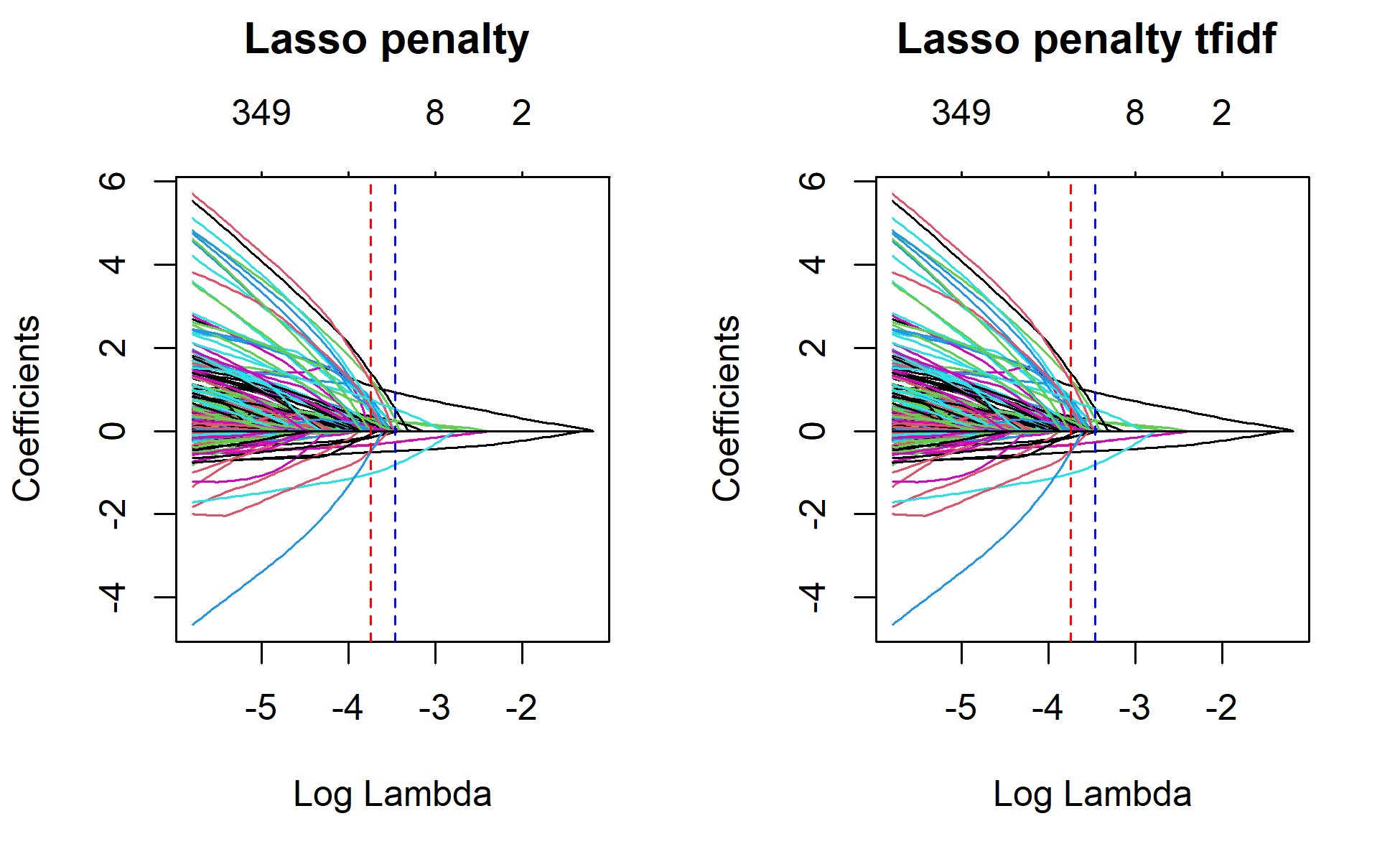
Classifying abstracts using regularized models: covid-19 or sars-2003?
Classifying abstracts using regularized models: covid-19 or sars-2003?

Scraping individual participant data from scatter plots
In this blog post, I demonstrated how to easily scrap individual participant data by digitizing a scatter plot of an old publication.
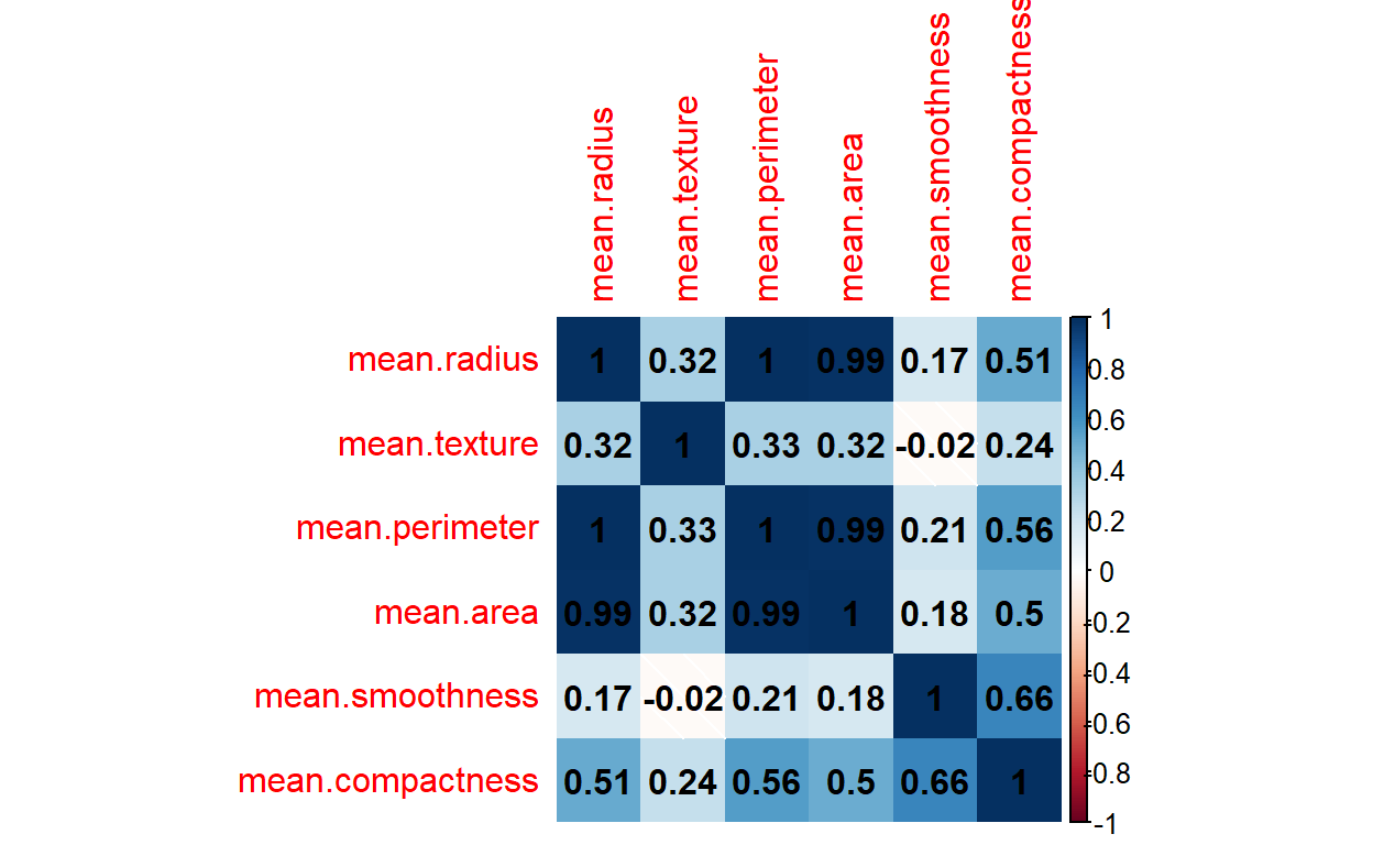
Corr plot and Pair plots matrix: Python vs R
Correlation heat map in R and Python
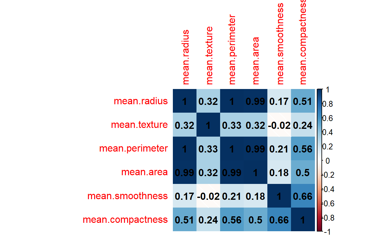
Corr plot and Pair plots matrix: Python vs R
Correlation heat map in R and Python
Plotting regression model coefficients in a forest plot
How to plot model coefficients in a forest plot.
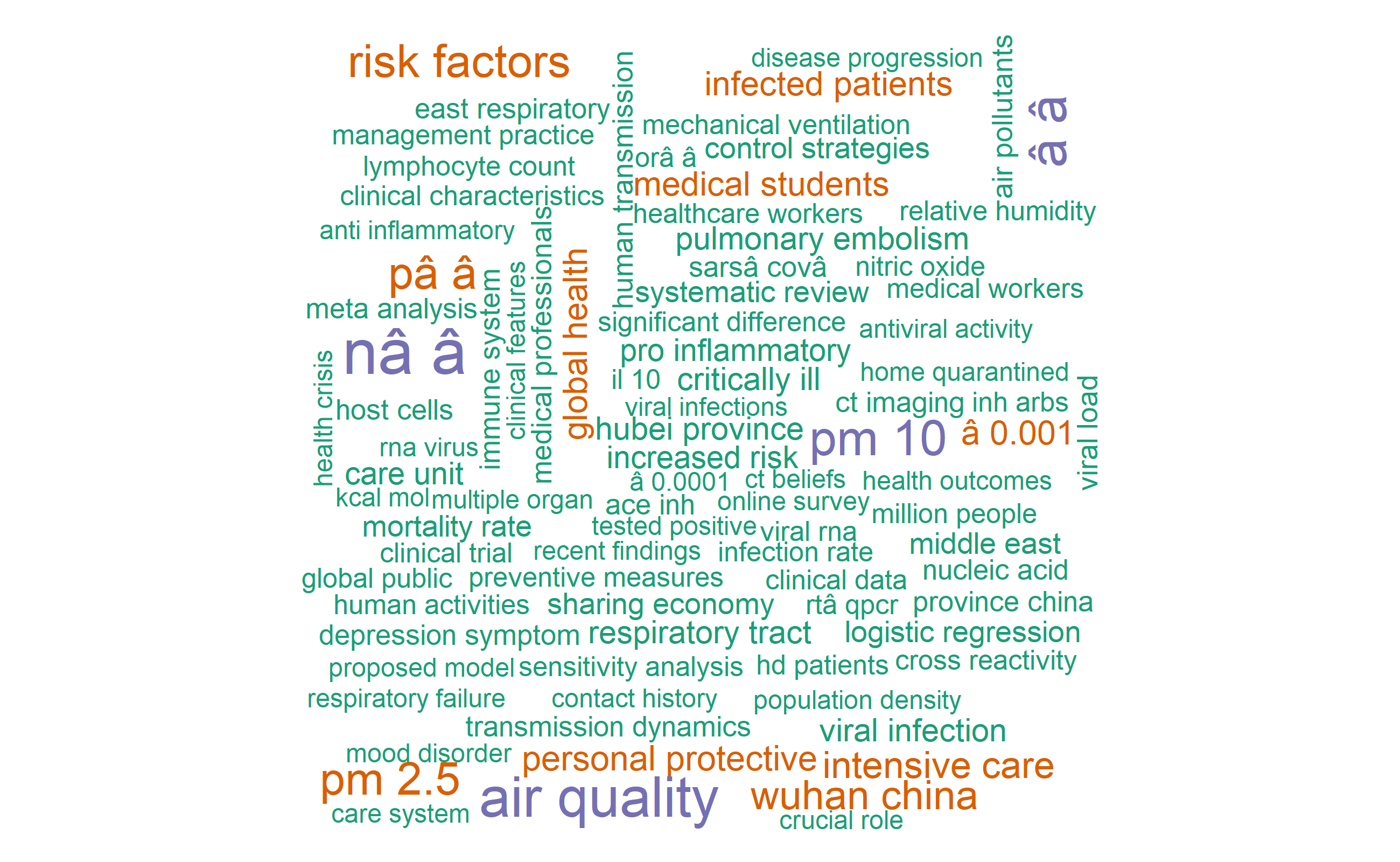
Applying text analyses methods on 382 COVID19 journal articles
This blog post is a continuation of my previous blog post on applications of text mining on sampled COVI19 publications.

Digital Reactions Towards Prime Minister Abiy Ahmed's Facebook Activities
Let's have some fun in visualizing Facebook reactions to prime minister Abiy Ahmed's Facebook posts (June 24 to August 09). This post is an updated version. The previous analysis was only until August 5.
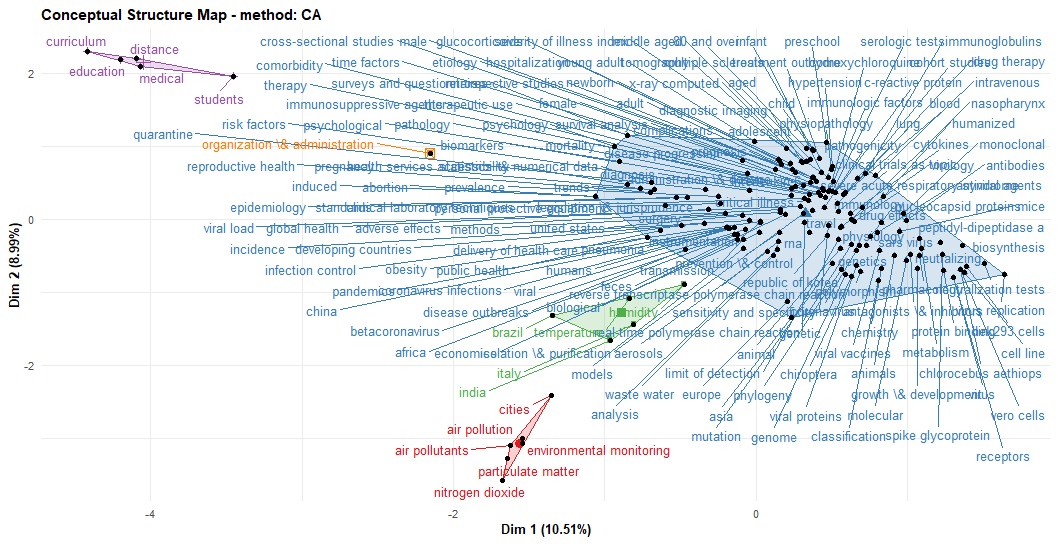
Applying bibliometric analysis and text mining to COVID-19 publications
Let's have a quick overview of what on COVID-19 related records were added in PubMed on August 03/2020.
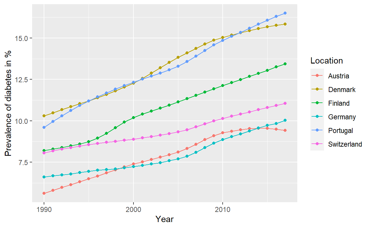
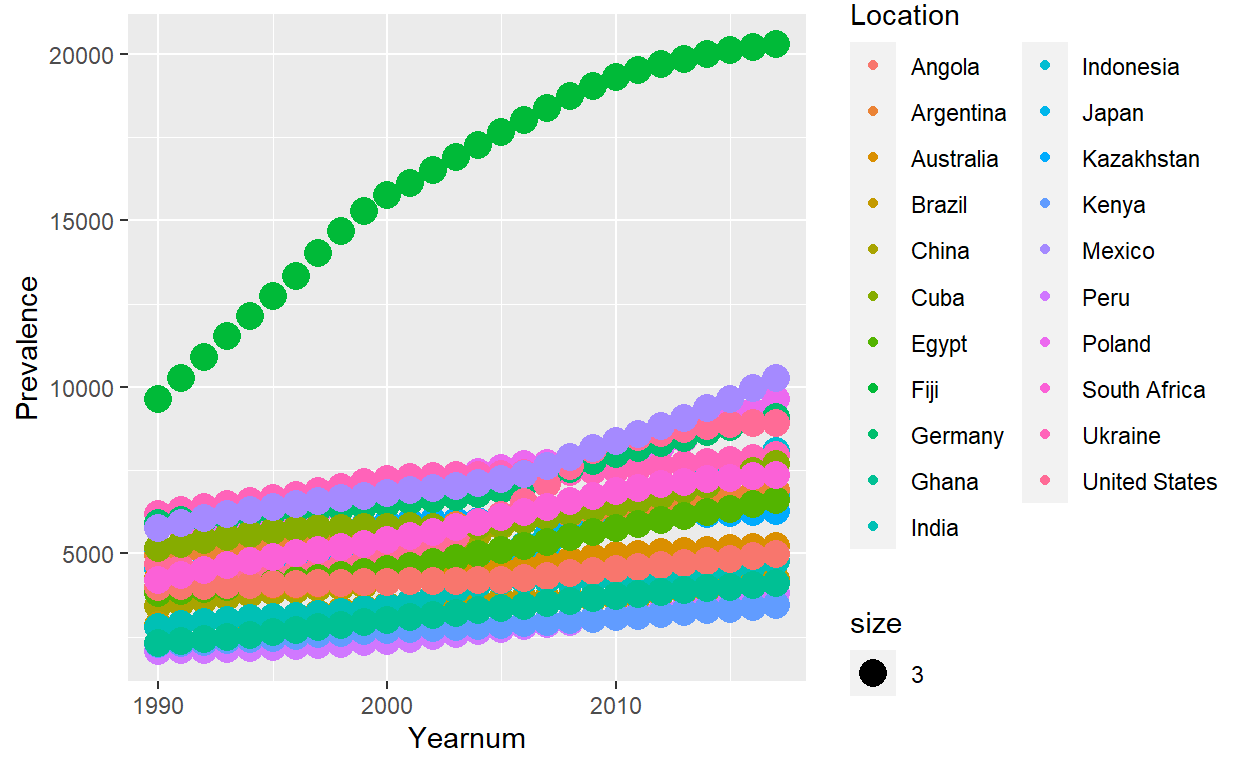
Visualizing the prevalence of diabetes in six European countries, 1990-2017
This is a quick demonstration of diabetes prevalence in six European countries. The data are from the the Institute of Health Metrics and Evaluation (IHME).
Animating scatter plots
Creating `Gif` for scatter plots
Animating bar graphs
Here we will have a quick look on how to create `Gif` or animated bar plots