Introduction
Correlation is often used to test the relationship between two or more variables. Pearson product moment correlation is the most commonly used method of calculating correlation coefficient. It mainly measures the linear relationship between variables. Spearman and Kendal rank correlations are a non-parametric measures of correlation.
Pearson correlation requires few assumptions to be met: linearity, normality, and absence of outliers. These assumptions should be met before doing the correlation. You can use Shapiro wilk test to to check whether a variable is normally is distributed using a simple command in r: shapiro.test(data$var). This test gives you W statistic and a p value. A p value of greater than 0.05 means you can assume “normally” in your variable.
\[ r_{x y}=\frac{n \sum x_{i} y_{i}-\sum x_{i} \sum y_{i}}{\sqrt{n \sum x_{i}^{2}-\left(\sum x_{i}\right)^{2}} \sqrt{n \sum y_{i}^{2}-\left(\sum y_{i}\right)^{2}}} \] rxy = Pearson r correlation coefficient between ,
n = number of observations
xi = observed value of x for ith observation, yi = observed value of y or ith observation
Without spending much time on the theory, let’s go directly to creating a correlation matrix and then we will visualize with a heat map in R and Python. Let’s use the cancer classification data.
For detail explanations. Please check the following video. https://www.youtube.com/watch?v=Z7ggbnj0dM0&t=2s
library(reticulate)
r_data  <- read.csv("cancer_classification.csv")
dim(r_data)
[1] 569 31colnames(r_data) [1] "mean.radius" "mean.texture"
[3] "mean.perimeter" "mean.area"
[5] "mean.smoothness" "mean.compactness"
[7] "mean.concavity" "mean.concave.points"
[9] "mean.symmetry" "mean.fractal.dimension"
[11] "radius.error" "texture.error"
[13] "perimeter.error" "area.error"
[15] "smoothness.error" "compactness.error"
[17] "concavity.error" "concave.points.error"
[19] "symmetry.error" "fractal.dimension.error"
[21] "worst.radius" "worst.texture"
[23] "worst.perimeter" "worst.area"
[25] "worst.smoothness" "worst.compactness"
[27] "worst.concavity" "worst.concave.points"
[29] "worst.symmetry" "worst.fractal.dimension"
[31] "benign_0__mal_1" Now, let’s read this in Python. I am using reticulate package to run r and python scripts in one RMD file.
import pandas as pd
py_data  = pd.read_csv("cancer_classification.csv")
The data has 31 variables and 569 observations. I will only select the first six variables for my correlation plot.
Notice in R counting starts from 1 while in Python it starts from 0.
Now in Python:
filter_py_data = py_data.iloc[:,0:6]
len(filter_py_data)
filter_py_data.shape
Next is producing the pearson correlation matrix in R and Python
r_corr_matrix <- cor(filter_r_data, method="pearson")
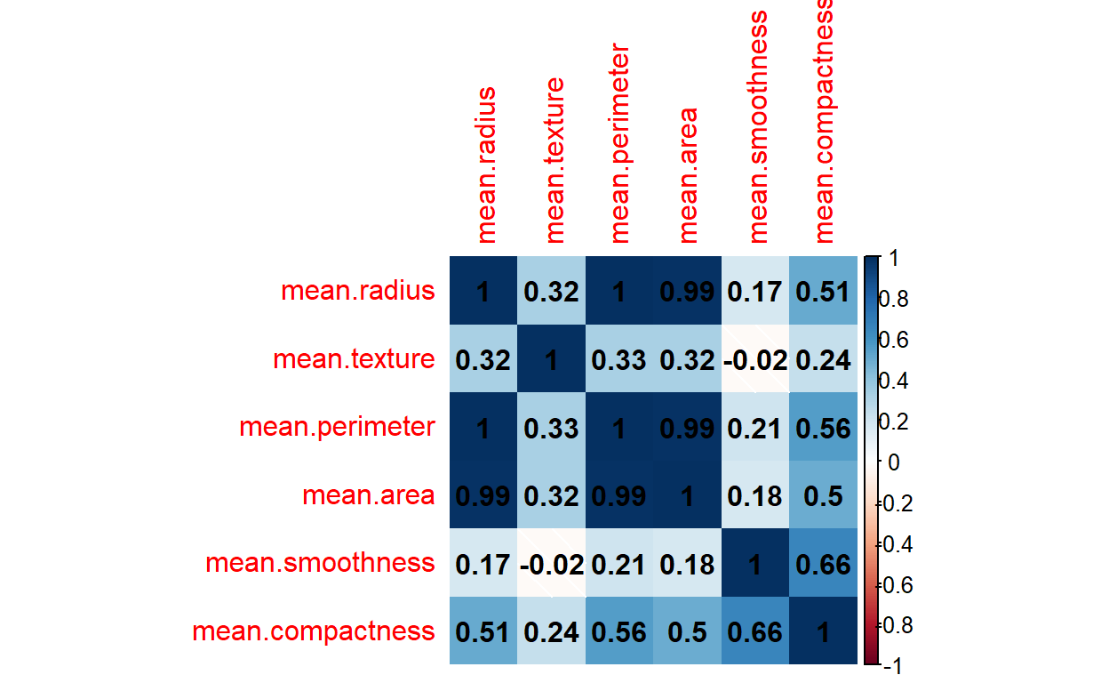
r_corr_matrix mean.radius mean.texture mean.perimeter mean.area
mean.radius 1.0000000 0.32378189 0.9978553 0.9873572
mean.texture 0.3237819 1.00000000 0.3295331 0.3210857
mean.perimeter 0.9978553 0.32953306 1.0000000 0.9865068
mean.area 0.9873572 0.32108570 0.9865068 1.0000000
mean.smoothness 0.1705812 -0.02338852 0.2072782 0.1770284
mean.compactness 0.5061236 0.23670222 0.5569362 0.4985017
mean.smoothness mean.compactness
mean.radius 0.17058119 0.5061236
mean.texture -0.02338852 0.2367022
mean.perimeter 0.20727816 0.5569362
mean.area 0.17702838 0.4985017
mean.smoothness 1.00000000 0.6591232
mean.compactness 0.65912322 1.0000000Now, in Python
py_cor_matrix = filter_py_data.corr(method="pearson")We have now produced our pearson correlation matrix in both R and Python. Next is visualizing them using corr heat maps. I use correplot package in R and matplotlib and seaborn libraries for producing for producing the correlation heatmaps in both languages
The corrplot() function has numerous additional arguments which you can play with. I will use few of them here.
Now, in Python
import matplotlib.pyplot as plt
import seaborn as sns
sns.heatmap(py_cor_matrix, annot=True, cmap="viridis")
plt.show()
I personally like the plot by seaborn. But, it is a personal taste.
Contact
Please mention @MihiretuKebede1 if you tweet this post.
If you have enjoyed reading this blog post, consider subscribing for upcoming posts.